
Monday, February 18, 2013
Semester 2: Self Portraits, Once More~
A new semester begin and again as a warm up exercise, we were instructed to come up with a self portrait, this time however, we are given the freedom to use anything we can find in the campus to complete our task within 1 and half hour. I was trying to come out with something that has a mysterious air around it with the undifine lines and smoky ink but... well due to the lack of skills, this is how it turns out.


Monday, November 12, 2012


Wednesday, November 7, 2012
Sunday, October 7, 2012
Color Theory Group Assignment
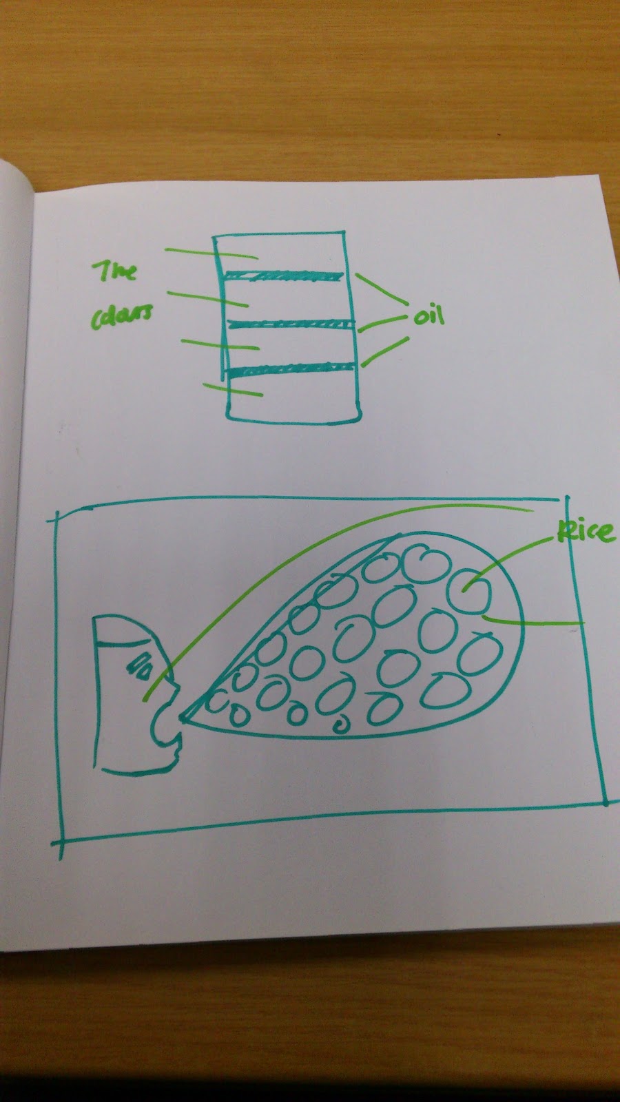
For the group assignment, we were give the task of creating a color wheel, but not just a simply color wheel, we have to use our creativity to come up with something interesting. After the discussion, our team decide to use colored rice to make the color wheel. As for patterns, we were going to do a spiral and some flowing waves, but Ms.Lisa advice us to make it more interesting instead of just plain patterns, she told us to explorer it and try mixing with other culture because our color wheel concept is somewhat based on the Indian tradition culture sand painting which the will do the most during Deepavali. She said because our color wheel are 'free' of the bound of physical forms, it has more possibilities to make it more interesting. (Progress will be updated soon)
Initial Idea Draft:

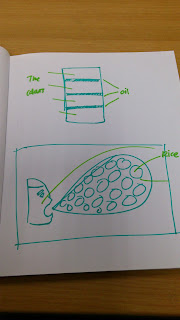

Initial Idea Draft:


Color Theory Individual Assignment Progress
This individual assignment requires us to create 2 versions of portrait based on your subject matters using different color values. We may choose to do it manually or digitally.
1st attempt:


1st attempt:


For my 1st attempt, I used some basic hot and cold color value to play around and get the hang of the software I used to c what kind of different effect it can make. I'm quite satisfy with the color values but the background makes it looks very sophisticated and not very eye pleasing. So i decide to pick a different subject matters with a less sophisticated background.
2nd attempt:


A little less sophisticated than the last 1 but the background are taking away the color values in my subject matter.
3rd attempt:


For the 1st portraits, I used blue analogous color and I decided to use a white background because it will bring bring out the color of blue. For the second portrait i used red-ish and orange-ish pastel series, I know in this portraits most of the color stand out better in a black background but i decide not to use it because there is brown color in my portrait and using black background might take away its value.
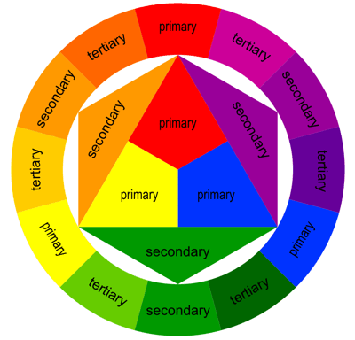
Lecture on Color Theory
Subscribe to:
Posts (Atom)