Sunday, October 7, 2012

Color Theory Group Assignment

      For the group assignment, we were give the task of creating a color wheel, but not just a simply color wheel, we have to use our creativity to come up with something interesting. After the discussion, our team decide to use colored rice to make the color wheel. As for patterns, we were going to do a spiral and some flowing waves, but Ms.Lisa advice us to make it more interesting instead of just plain patterns, she told us to explorer it and try mixing with other culture because our color wheel concept is somewhat based on the Indian tradition culture sand painting which the will do the most during Deepavali. She said because our color wheel are 'free' of the bound of physical forms, it has more possibilities to make it more interesting. (Progress will be updated soon)


Initial Idea Draft:


Color Theory Individual Assignment Progress

       This individual assignment requires us to create 2 versions of portrait based on your subject matters using different color values. We may choose to do it manually or digitally.


1st attempt:


       For my 1st attempt, I used some basic hot and cold color value to play around and get the hang of the software I used to c what kind of different effect it can make. I'm quite satisfy with the color values but the background makes it looks very sophisticated and not very eye pleasing. So i decide to pick a different subject matters with a less sophisticated background.


2nd attempt:


       A little less sophisticated than the last 1 but the background are taking away the color values in my subject matter.


3rd attempt:


       For the 1st portraits, I used blue analogous color and I decided to use a white background because it will bring bring out the color of blue. For the second portrait i used red-ish and orange-ish pastel series, I know in this portraits most of the color stand out better in a black background but i decide not to use it because there is brown color in my portrait and using black background might take away its value.

Lecture on Color Theory

           On the previous POD lecture, Ms.Lisa brief us about the study of color, there 3 types of color in the color wheel: primary color, secondary color and tertiary color. Colors that are arrange side by side in the color wheel are called analogous color, analogous color has a similar but differnet intensity color scheme. Colors that are directly opposite each other are called complementary colors, it allows to create a maximum constrast  and stability. Part of color theory also consist of color harmony which teaches us to mix and match colors in a more compatible way to make it looks eye pleasing. And after the lecture we were given an individual assignment and group assignment.


Tuesday, September 25, 2012

Paper Cut Out Presentation

~Phantasmal fairy~
For this piece of work, i kind of wanna make it like a ancient wall painting recording the fairies mystical and super natural abilities, the colour combination of black and white also add a little mysterious feeling it, and also i tried to make it look as illusionary/phantasmal as possible, but because of my lack of skills this is the result.

~Angel Of Night~
For this piece of work, i used the movie 'charlie's angel' and the game 'Bayonetta' as my guide lines, the similarities of those 2 mentioned above is beautiful and hot lady fighting in a stylish, sexy and 'badass' kind of way, so i cut out a 'sexy' posed lady angel figure standing at the roof of building in the night giving the feeling like 'evil doer beware, this sexy lady is gonna kick your butt'. However, the colours combination didn't really turn out well because they are all neon colours to bring out dominance because all of the neon colours all very eye catching.
         

Brochure

             During the POD lecture on the previous Monday, we were given a class activity to create a brochure. We were given 1 hour to gather the material and come up with the design to create the brochure, 1st we must select 1 topic for our brochure, then we need to select colour theme(s) for the brochure, it is important to note that we should select the colour based on our topic to bring out the feeling and massage it convey or at least make it constrast and pleasant to look at. We were require to work in pairs for this class activity, me and my partner went to search for useful booklets,flyer and brochure to use it as examples, we couldn't find any at first but we soon had an idea of going to the service center and take some of the free courses intro booklets. From the examples we gathered, we decide to use culinology as our topic, and we choose the colour white, light yellow, and red as our colour theme, the white and light yellow matches really well and keep our brochure at a neat look while the red attracts the readers attention, this combination of colours also brings out the image of professional chief because its is clean at the same time attract your attention just like how the classy food would. After all this work, we are needer to prepare our own grid layouts for the brochure, because our topic is culinology so we tend to keep in clean and neat at the same time a bit eye catching. These are the process of making and the final outcome of the brochure:


Assignment: paper cut out

         We were given an assignment to do paper cutting, we are required to cut out 2 paper cutting, and the artwork must show balance & symmetry and the other must show dominance, space and weight. We were told to catalog our progress of work and below are my progress:


                                                                    Balance & Symmetry


Saturday, September 22, 2012

Grid presentation

                We did our grid design presentation and Ms.Lisa said that it is overall not bad since it is our 1st time, she said that we have to be careful with our margins and the justification of our work. Other that that, she also note that our gutter should not be bigger than our margins as it will make it look weird and unbalanced. And most of us has no problem with mounting our work but she stated that we should always make our works look professional and neat as it will increase attractiveness to our work.

Furniture presentation

          We finally meet our dead line for this assignment and the time has come for us to present our furniture to the class.


Monday, September 17, 2012

Assignment 4 progress and understanding

            Based on the lecture and assignment of grid studies, i have now understood and grasped the uses of grid ( kind of). By using grid in our design, we are able to organised it in a balance and eye-pleasant way to look at. Based on our content, we will need to choose a suitable grid for the page layout and rules in order to make our work more organised. Now most of the grid are made of lines, and each lines has their own role in help us to compose our work, these lines are margin, flow line, column, row, gutter, module, spatial zone.Not all grid layout have all 7 lines but each line play their roles in helping us organized our work. And other than organizing our work, different ways of positioning your content also can create a different visual effects for our work to convey the emotion,feelings and inspiration in our work. different size of word, picture and boxes also can create visual effect. To sum it all up grid help us to organised, convey our message, and create a more pleasant looking design.


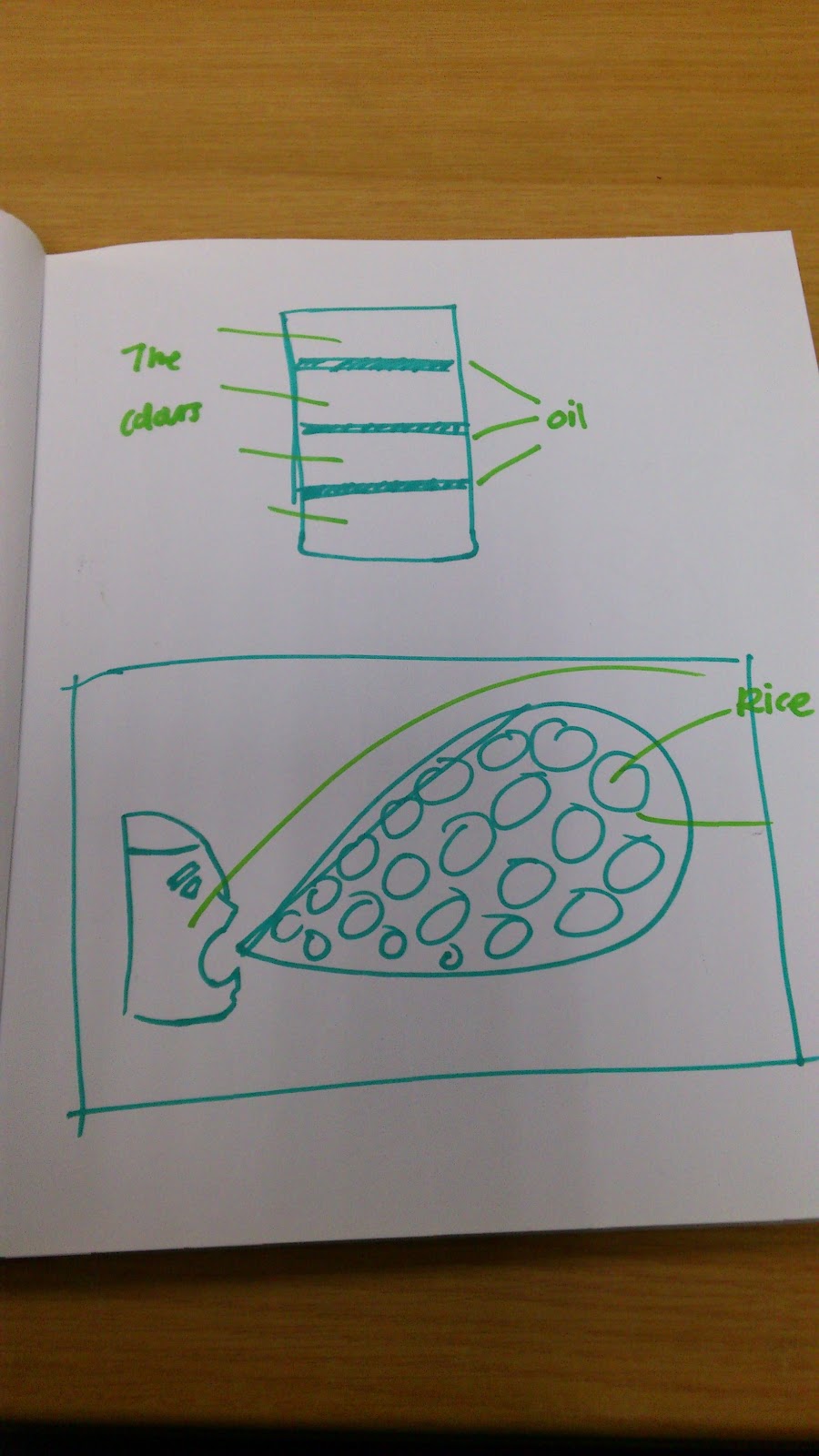
         Below are the completion of my work:


Tuesday, September 11, 2012

Lecture on Grid Studies.

          Today on POD, we were taught about grids. Grids are actually the guide line we used to organize, compose, balance and bring order to our frame work, its is important to follow these rules to make our design look more better and not to sophisticated. Grid are made of seven different lines and space: Margin, Flow line, Column, Row, Gutter, Module and Spatial zone. There also different types of grid such as 3/4/5 column grids, golden ratio, columns and baseline grid. Different grid are used on different page layout for different reading materials etc. During class activities,we were asked to identify the grid types used in the reading materials we bring and also we were given a simple task of designing our own way of placing and decorating our layout using the grid system, the purpose of this exercise is to help us grasp and understand the concept of grids and teaches us to balance and bring order to our design.


Tuesday, August 28, 2012

POD tutorial on furniture concept

             During this tutorial we were required to present and showed our furniture concept to Ms.Lisa, we showed her our finalized concept and explain the uses of materials and how it look. After that, Ms.Lisa offered us more option and advice to improve our design, she also offers ideas to cover up for our furniture if       we somehow end up unable to produced what we desire based on our concept. Ms.Lisa also advice us to do some research on the furniture's design category, materials' quality, pattern composition and rationale. We have already come up with the rationale of the furniture and that rational would be to provide relaxation and convenience for the buyer, and our concept focus primary on working class people in the age of 25 to 50. We also target environmentally conscious individuals as our furniture materials are based on the concept of recycling, environment friendly and 'Go green'.

            This is our finalized furniture concept : 


Group discussion for POD furniture concept


               Today, before POD tutorial we had 3 hours of break, so our group decide to once again gather and discuss the furniture concept before presenting it to Ms.Lisa during the tutorial. We gather at the student life center and begin to revise the older design that everyone come up with. One of our member Lee Chia even made a small scale model of her concept. We pick and choose out the more good looking ones and tried combining it or add something to it. Here are some pics of the furniture concept :


           And here are some pic we found in the net during our discussion that we took ideas from :
            cardboard-chair.jpg
            gehrywigglechair.jpg
            Chair 3
            Chair 4